Paint Matching Explained: How Close Is Colour Matching Paint and When to Use the True Brand
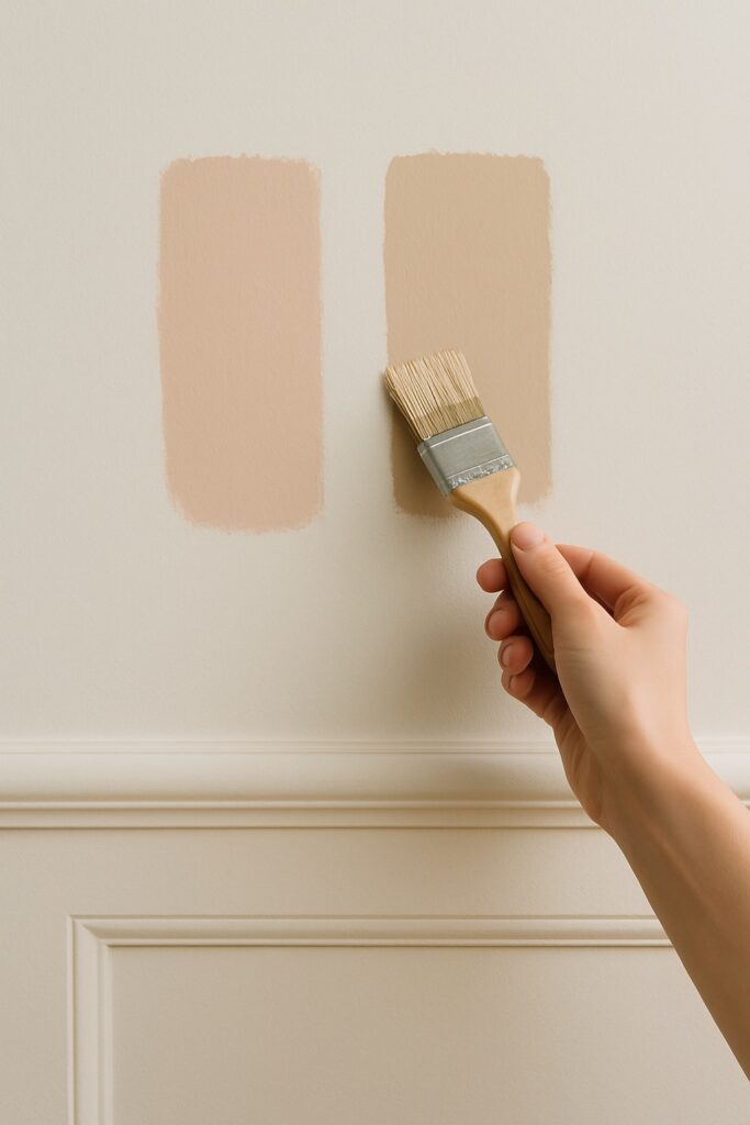
Many homeowners assume that when they request a colour match, the result will look exactly the same as the original paint shade. In reality, colour matching paint provides an approximation that often appears close but is rarely identical. Industry tests suggest that colour matching through spectrophotometer technology is usually around 90 percent accurate. This means the colour may look similar at first glance, but it can shift noticeably in undertone, depth or warmth once applied to your walls.
For some projects this level of similarity is absolutely fine. However, in a carefully considered designer scheme where light, materials and architecture all play a part, even a subtle shift can change the overall feel of the space. In this post, we will explore what colour matching actually means, when it can work well and why choosing the true brand is often essential when working with a colour consultant.
⸻
What Colour Matching Paint Actually Means
Colour matching involves scanning a sample or referencing a known shade to recreate a near-identical tint in a different brand. It relies on machines that read the colour profile and then mix pigments to approximate the shade. Although this technology is impressive, matched colours are consistently described by professionals as close but rarely identical.
This is because each paint manufacturer uses its own blend of pigments and binders. As a result, even the closest match can vary in richness, depth or undertone. Differences in bases, sheen levels and drying behaviour also influence how the colour finally appears on the wall.
⸻
Why Colour Matching Paint Is Not Fully Exact
Even slight formulation changes can alter the way a colour reads in your home. You may notice:
• Warmer or cooler undertones appearing after drying
• A shift in depth or clarity
• A flatter or chalkier finish compared to the original
• Variations that become more obvious under natural light
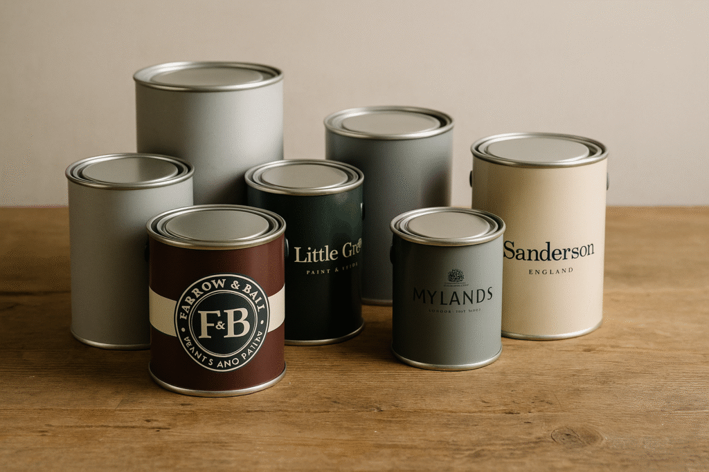
Premium brands such as Farrow and Ball, Little Greene, Paint and Paper Library and Mylands use high quality pigments that create complexity and nuance. When a more budget friendly brand attempts to imitate the shade, undertones may flatten or shift completely.
This is especially noticeable with whites, soft neutrals and pale greys. These subtle colours react strongly to even the slightest pigment change, so a matched version may read pinker, greener, creamier or cooler than the intended shade.
⸻
When Colour Matching Paint Can Work Well
There are many situations where colour matching paint can be a good option:
• You are working within a tight budget
• The project is a rental, refresh or temporary solution
• You need a quick alternative
• Precision is less important in the overall scheme
• You simply want to get close to the inspiration colour
In these scenarios, matched paints can provide a pleasing result at a lower cost.
⸻
When You Should Choose the True Paint Brand
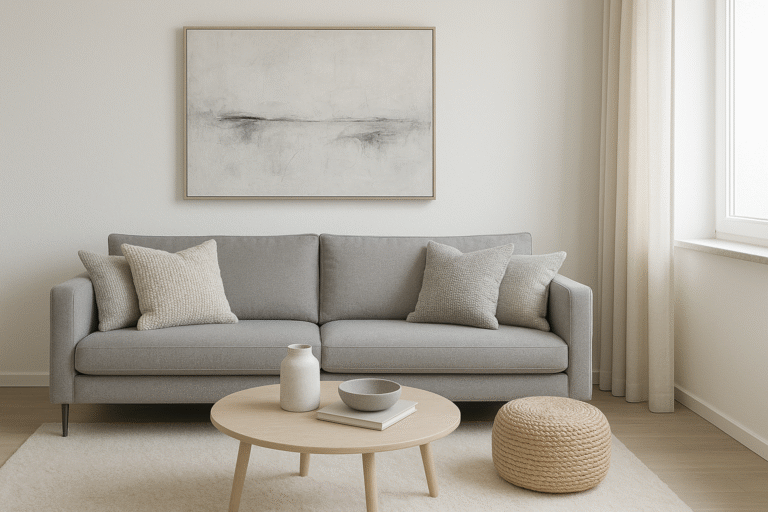
When you work with a colour consultant, the recommended palette is created through a detailed analysis of the space. This includes the direction of natural light, architectural detailing, flooring, existing finishes, adjoining rooms and the mood you want to achieve. Every colour choice has a purpose, and its undertone structure is selected carefully for your home.
Replacing one of these shades with a colour matched version may look similar, but it can undermine the analysis behind the palette. For example, a white chosen for its soft pink undertone may shift cooler when matched, or a muted green based grey may become lilac. Once these undertones change, the palette may lose its harmony.
This is why choosing the original paint brand is crucial when accuracy and balance matter.
⸻
Why Whites Are Especially Difficult to Colour Match
Whites are some of the most complex colours in interior design. A white may lean pink, green, yellow, grey or neutral, and these shifts can be incredibly subtle. When a white is colour matched, the undertone structure often changes because there is less pigment to stabilise the colour. As a result, a warm white may become cooler, a neutral white may appear creamier or a soft grey based white may become more beige.
Because whites are heavily influenced by natural and artificial light, even a small change can significantly affect the atmosphere of the room.
⸻
Practical Advice If You Are Considering Colour Matching Paint
If you are thinking about colour matching instead of purchasing the original brand, here are a few helpful tips:
• Always match the finish, not just the shade
• Compare the original and the match in natural daylight
• Test in multiple lighting conditions throughout the day
• Consider how undertone shifts may affect joinery, flooring and fabrics
• Use colour matches for low risk or budget driven projects
• Choose the true brand for high precision designer schemes
By approaching it intentionally, you can make the right choice for your home and budget.
⸻
How a Colour Consultant Adds Value
A colour consultant considers far more than a single paint shade. The process includes analysing natural light, identifying undertones, creating room-to-room flow and ensuring the palette supports the mood and architecture of the home. Using the exact brand and finish ensures the palette behaves as intended, which protects the design outcome.
Colour matching paint may still look lovely, but it may not deliver the nuance, richness or harmony that the original palette was designed to achieve.
Further reading:
“Is colour matching your paint ever a good idea? – House & Garden
“Colour Matching Between Paint Brands – Does it Work?” – Kylie M Interiors
⸻
Conclusion
Colour matching is a helpful and often cost effective option for many homeowners, but it is rarely perfect. It can work beautifully in the right context, especially where budget or practicality comes first. However, when working with a tailored palette created specifically for your home, choosing the true brand ensures accuracy and confidence.
If you would like expert guidance in selecting colours that feel intentional, harmonious and tailored to your home, our Colour and Light Consultations are designed with exactly that in mind. We cannot wait to work with you, so Contact Us to begin.