50+ Shades of Grey: Understanding Undertones (With My Top 5 Designer Pairings)
Why We All Went Through the Grey and White Era
Let’s be honest, most of us have lived through the grey and white era.
I certainly have. Even as an interior designer and colour and light consultant, I have had phases in the past where grey walls and crisp white trims felt like the safest, cleanest and most convenient option.
And there is a reason for that.
When you are unsure where to begin with colour, grey feels like a comfortable step forward from stark rental white. It feels neutral, it feels calming, and it feels easy to accessorise. Grey and white is a palette many people choose when they want to look intentional without taking risks.
However, the grey and white era also created a lot of cold and flat rooms, not because grey and white are wrong, but because the wrong undertones were chosen.
Here is the truth.
There are not simply “greys” and “whites”. There are hundreds of nuanced shades within each category, warm, cool, stone, putty, taupe, pink based, yellow based, lilac based, green based and many more.
When you choose the wrong undertone, you feel it instantly.
A grey that turns blue in the morning light.
A white that looks cold against oak flooring.
A neutral that suddenly appears lilac or green depending on the time of day.
A room that feels flat and lifeless no matter how well it is furnished.
The right grey or the right white can completely transform a space, but they have to be thoughtful, intentional and aligned with your architecture and natural light.
Below are my top five designer pairings, curated across different brands, grounded in undertone expertise, and selected for their warmth, balance and versatility.
Five Foolproof Grey and Neutral Pairings That Always Work
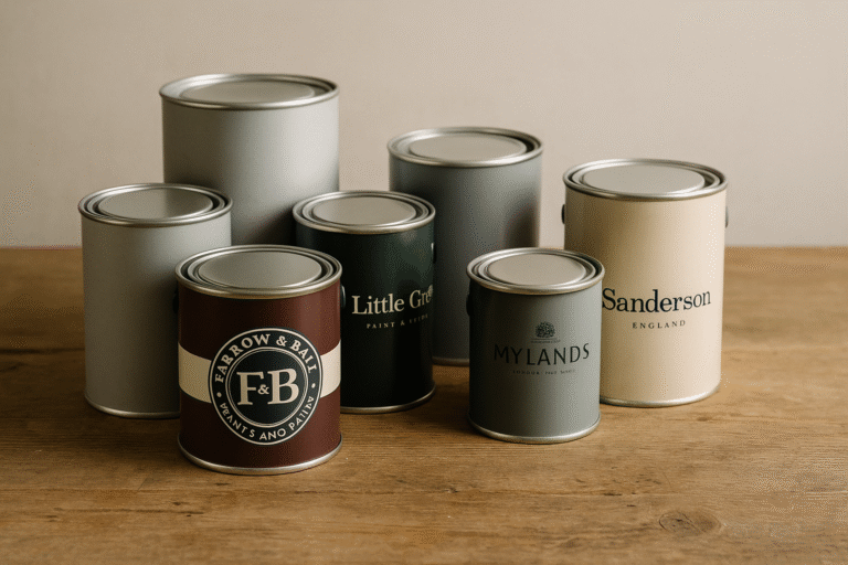
These pairings are intentionally cross brand and undertone led, showing why a professional colour consultancy goes far beyond choosing one brand’s whites and greys.
⸻
1. Soft Traditional Grey With a Creamy Gentle Neutral
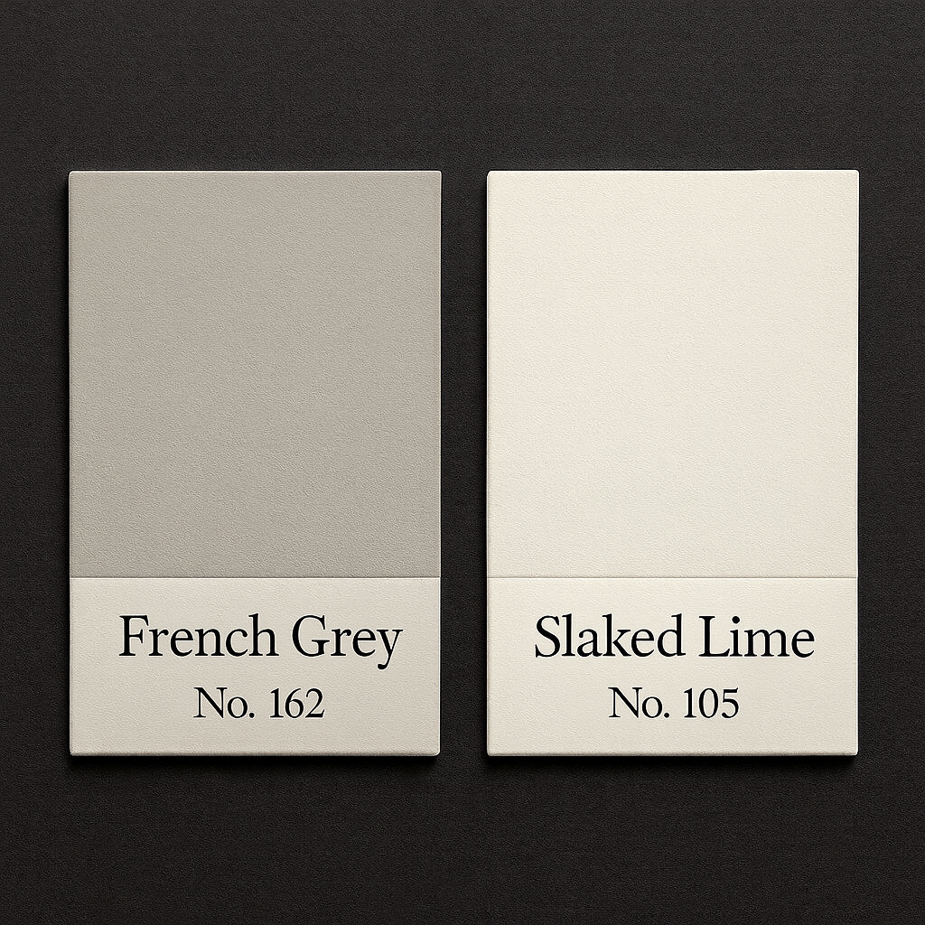
Grey Tone: French Grey Mid, Little Greene
Neutral Tone: Slaked Lime, Little Greene
Why it works:
French Grey Mid is a soft, traditional grey with a warm yellow stone and taupe undertone. This warmth brings calm and gentle character to a room without feeling heavy. Slaked Lime adds a creamy softness but still carries a fine grey undertone, which keeps it refined and prevents yellowing.
Best for room orientations:
• North facing rooms: Excellent, the warm undertones counteract the cool natural light.
• East facing rooms: Beautiful in morning light and soft throughout the day.
• South facing rooms: Works very well, the warmth holds steady without shifting.
• West facing rooms: Lovely in the evening as the taupe element glows gently.
⸻
2. Warm Oatmeal Greige With a Balanced Clean White
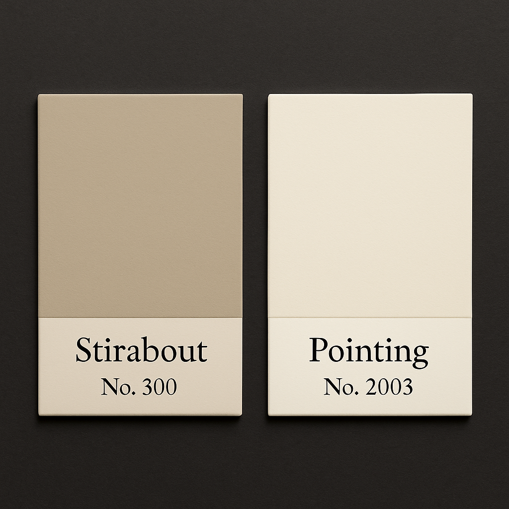
Grey Tone: Stirabout, Farrow and Ball
Neutral Tone: Pointing, Farrow and Ball
Why it works:
Stirabout is a warm oatmeal greige with a soft pink stone undertone, which gives it a nurturing and grounded feel. Pointing is a clean, warm white that feels fresh but never clinical, making the combination refined and timeless.
Best for room orientations:
• North facing rooms: One of the best choices for cold light because the warm greige immediately softens blue grey shadows.
• East facing rooms: Harmonious morning through afternoon with the pink beige warmth staying consistent.
• South facing rooms: Works beautifully but consider pairing with natural textures to avoid too much warmth.
• West facing rooms: Excellent, the pink undertone becomes incredibly flattering in golden hour light.
⸻
3. Cross Brand Pairing: Mauve Grey With a Soft Stone Neutral
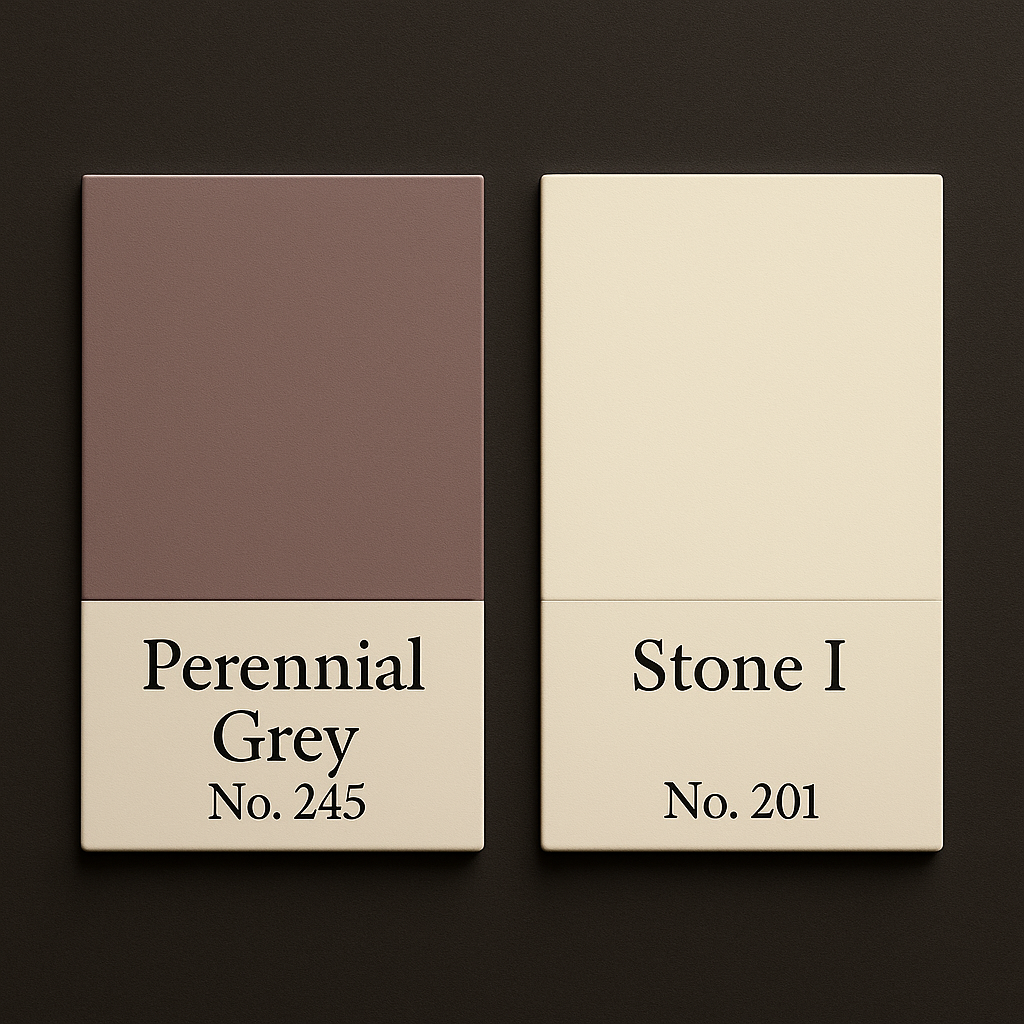
Grey Tone: Perennial Grey, Little Greene
Neutral Tone: Stone I, Paint and Paper Library
Why it works:
Perennial Grey has a subtle mauve and lilac undertone that gives depth and softness without feeling cool. Stone I has soft beige stone undertones that balance the grey perfectly.
Best for room orientations:
• North facing rooms: Excellent, the mauve undertone neutralises cold northern light.
• East facing rooms: Works very well, the grey feels fresh in the morning and the beige undertone warms through the afternoon.
• South facing rooms: Muted and elegant, direct sunlight softens the lilac quality.
• West facing rooms: Particularly lovely as warm evening light enhances both colours.
⸻
4. Complex Grey Green With a Creamy Soft White
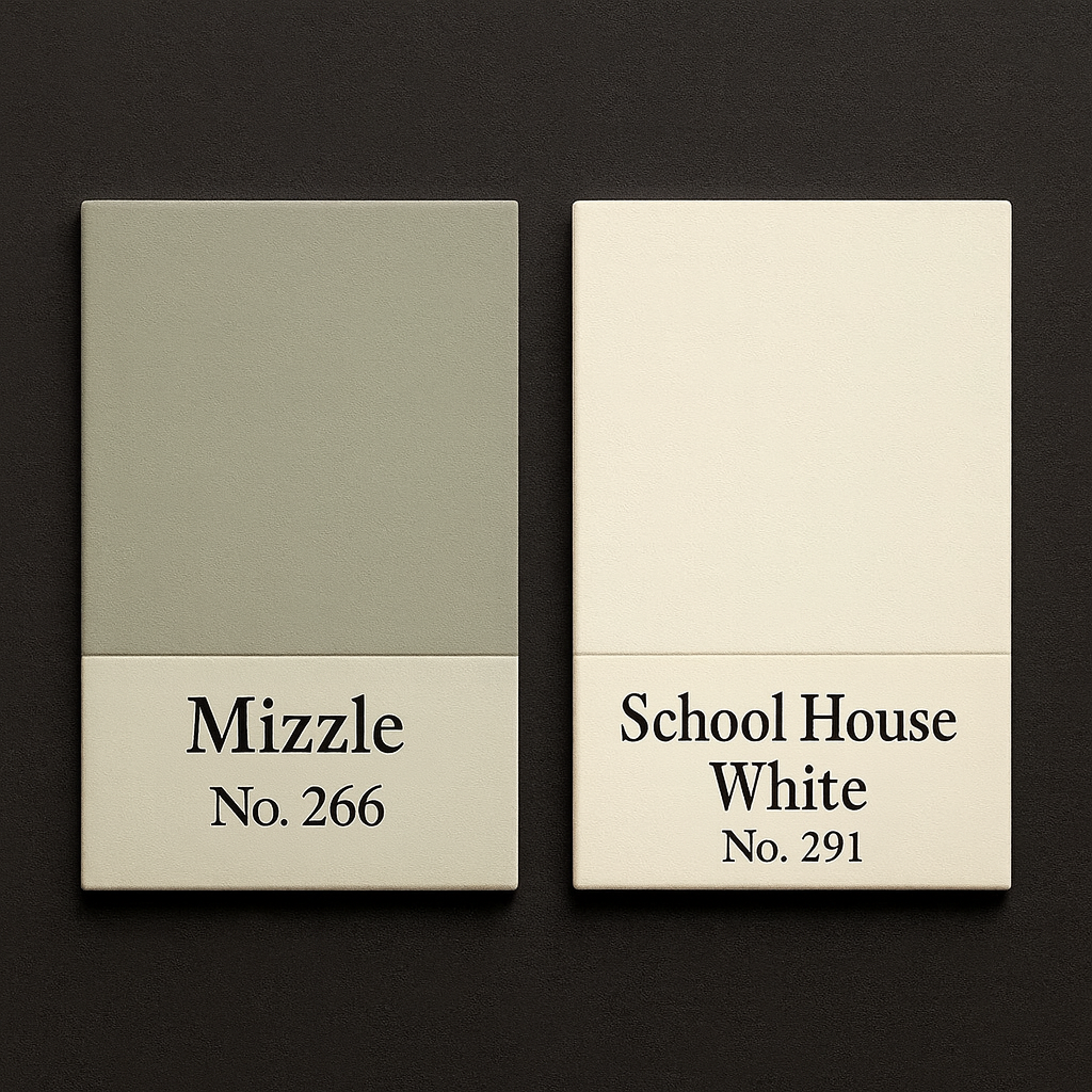
Grey Tone: Mizzle, Farrow and Ball
Neutral Tone: School House White, Farrow and Ball
Why it works:
Mizzle shifts beautifully between grey and green and has an atmospheric depth that responds well to natural light. School House White is a creamy and comforting soft white which pairs effortlessly.
Best for room orientations:
• North facing rooms: Works if you want a green note but can feel cool if you prefer warmth.
• East facing rooms: A perfect choice, morning light enhances the green and feels fresh.
• South facing rooms: Lovely, the warm sunlight softens the green tone creating a gentle neutral.
• West facing rooms: The pairing becomes warm and atmospheric in evening light.
⸻
5. Deep Brown Grey With a Bright Yet Creamy Neutral
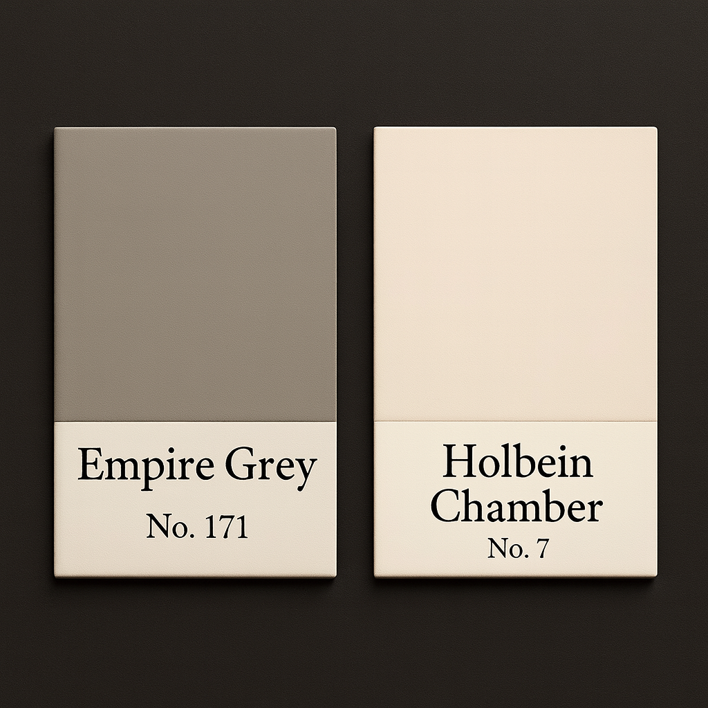
Grey: Empire Grey, Mylands
Neutral: Holbein Chamber, Mylands
Why it works:
Empire Grey has a deep brown umber undertone which adds richness and sophistication without feeling heavy. Holbein Chamber lifts the palette with creamy brightness and balances the depth perfectly.
Best for room orientations:
• North facing rooms: Surprisingly strong because the warm undertone offsets the cool light.
• East facing rooms: Calm and grounded in morning light.
• South facing rooms: Elegant and warm, the grey never appears flat.
• West facing rooms: Stunning, evening light enhances the warm brown undertone.
⸻
Why Undertones Matter More Than Colour Names
A colour labelled as grey may turn blue, purple or green depending on your orientation and light.
A neutral labelled as white may appear yellow, pink, stone or slightly grey.
This is the difference between a room that feels fine and a room that feels finished.
Your flooring, furniture, textiles, architecture and natural light all influence how a colour behaves. Understanding undertones is the key to creating a cohesive, warm and well balanced home.
⸻
If You Are Ready To Move Beyond The Grey and White Era
Grey and white will always have a place in timeless interior design, but only when they are chosen with intention and nuance.
If your home feels flat, cold or “almost right but not quite”, it is likely an undertone issue.
A colour and light consultation can help you harmonise your home, avoid costly mistakes, and bring warmth and clarity to your palette.
⸻
Work With Me
I offer virtual and in person colour and light consultations tailored to your home’s orientation, light and personal style.
Your consultation includes:
• Bespoke guidance across multiple premium paint brands
• Undertone led recommendations
• A cohesive room by room palette
• Advice for flow, warmth and atmosphere
• Confidence and clarity in your choices
Explore my Colour and Light Consultancy Packages or Get in Touch to book a complimentary discovery call.